
I recently found a font I’ve been searching for on and off for years. Turns out it’s name is Amalgama and it’s the font that got me into design.
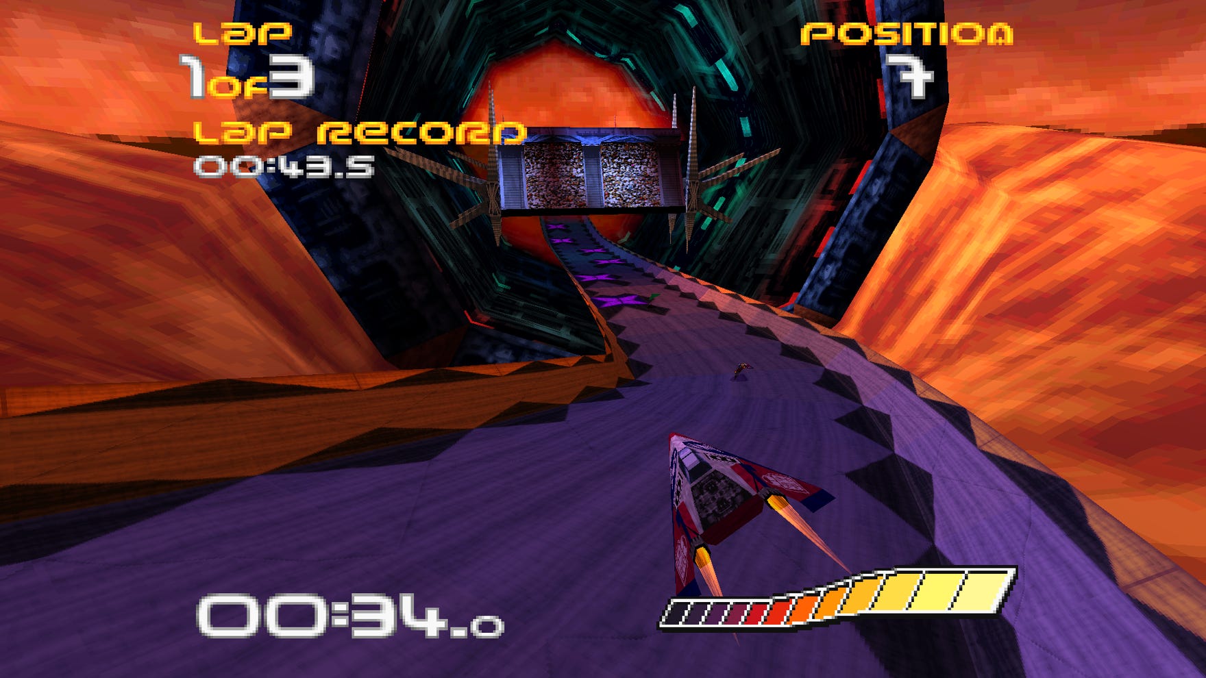
So taking you back some 26 years, to the late 90s, as a school kid browsing the magazine rack for gaming literature. I came across a copy PlayStation magazine, on the cover was the futuristic racing game Wipeout.
I was instantly drawn to the graphic design featured in the image, it was bendy but somehow angular, edgy and cool in equal measure. This drew me in so much I was hitting the search engines to learn more about this mysterious game.
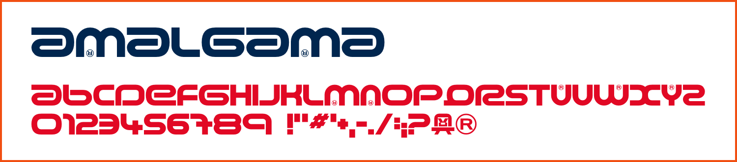
Amalgama is a display font in my opinion, however this font is used throughout the game including on the duel case sleeve and through the game’s UI. That includes the menu screens and also the in game HUD. Arguably not the most legible font, especially from a distance, it still brilliantly represents the futuristic yet irreverent style of the early Wipeout series.

Leave a comment