
I wanted to list some important lessons I’ve learned whilst setting up a design system library in Figma. I’m still finding my feet, but making steady progress.
It may seem complex, but once you have it all set up, the design system library in an incredible way to speed up creative decision making across a multitude of figma components.
Number 1
Start with foundations
There will be a values and elements that the rest of your design system components will all depend on. These include; colour values, typography, layout and spacing to name a few.
Why do we call them foundations? Well because every other element in the design system will depend on them. Much like a house, every other element will sit on top of the foundations.
Looking back now with hindsight, I realise the important of establishing at least a viable version of the foundations document, the reason being changes will need to be made later once we start to build components. For example, background colours of components may cause text to not not accessible.
Number 2
Build a complete icon pack
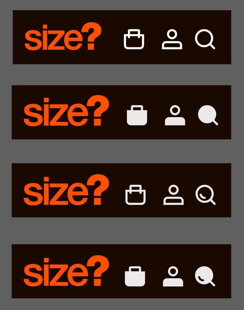
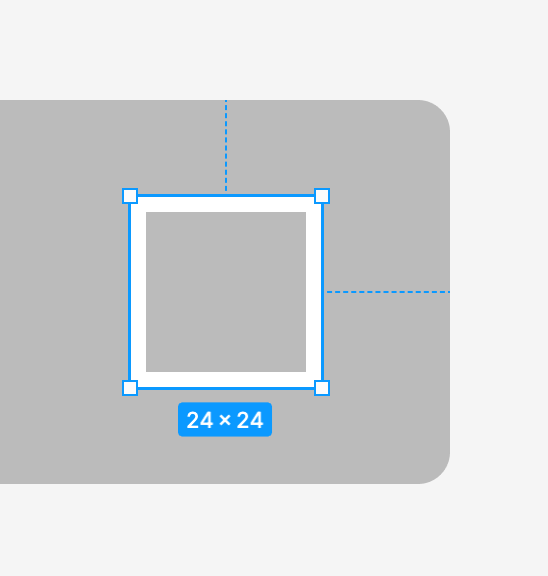
An icon pack is very important as vector icons will form an important element for communicating meaning to users. Icons can also support users with accessibility concerns as well as helping international customers understand the purpose of certain elements on the page. Icons can be difficult subject and require a certain amount of consideration themselves. However, by sticking to certain rules, we can ensure that icons are highly visible, accessible and consistent.
I have found that button labels aren’t always an option particularly on smaller device screens. Therefor your UI icons need to stand alone and be able to communicate meaning to users.
Number 3
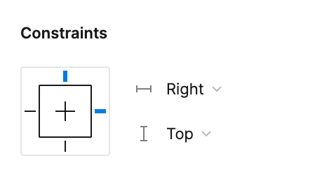
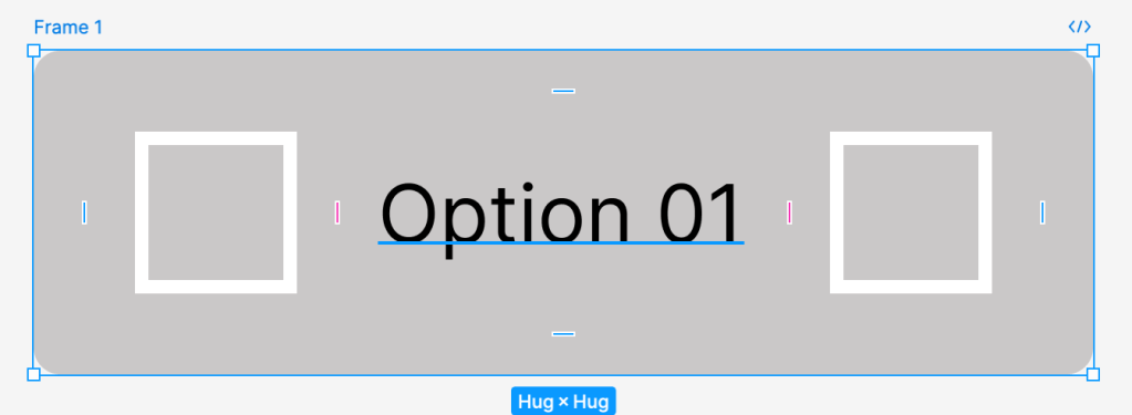
Set alignments before creating auto layouts
It’s useful to decide how you want to align elements of a component before you create an auto layout. Figma needs to know how you want the contents of a component to appear before you automate the layout of a component. This will save you time later when you start to scale components to fill containers.
For example, if your button has a right hand side icon, makes sense to set the alignment to the right of the icon. This means that when you resize the button, you won’t have to change the icon position, it will just move in relation to the right hand edge of the container.
Number 4
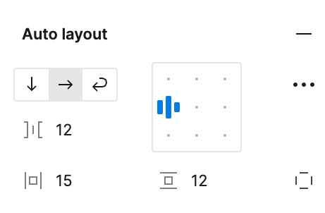
Using the auto layout feature
When beginning to combine components in Figma, I have often found myself having to set the nested component to fill the width of it’s container. There will certainly be times when this is necessary, however, when combining components it’s important to ensure that the nested component flexes within the container. This will save time and make your components more flexible when you come to compile groups of components and also whole pages.
Number 5
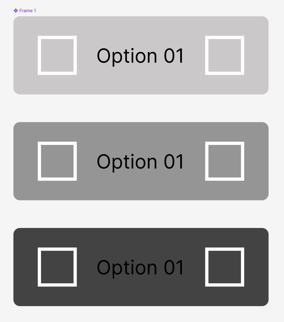
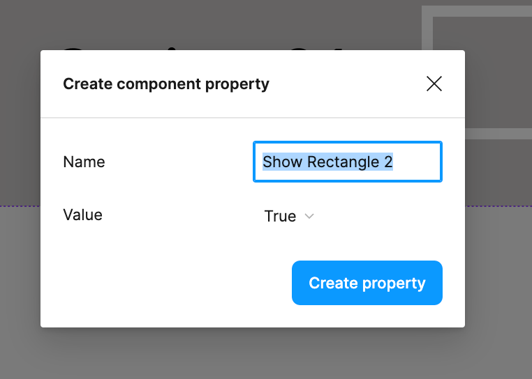
Create Boolean States
It’s pretty important to ensure that when you come to start using your design system, that you minimise the amount of manual work you need to do when designing. After all, its about saving time and energy so you can focus on delivering great user experiences. That said, a really useful tool in Figma is Boolean states, to do this just click on the layer of design element that you want to toggle next to title of the ‘Layer’ panel on the right hand side.
The next step is to simply set the true/false options based on whether you want that element to be visible by default. Boolean states mean that you can swap out assets from your Figma library without having to detach variants from their main components, when adding them to your design. This makes life easier for us as designers, increases the speed of our work flow and maintains consistency.
So there you go, just a few lessons I picked up whilst setting up a design system. If these points were useful to you, or I got anything wrong, drop me a comment I’d love to hear from you.
 Jake Bolton
Leave a comment