
Recently while working on design systems for size? Group, I’ve begun to understand the power of modularity in design systems. This is especially true when using the library functions in Figma.
Building on work from colleagues in JD Sports have recently begun working to set up design systems for size?, Footpatrol and the HIP Store. During this process I was able to see the way in which style libraries, icons and components all come together to create design tokens and web pages with a design system document.
Similar to the way style sheets can be used in web development, style libraries such as typography and colours, once set up can be applied to multitude of components. This may not be news to many, however I’ve begun to see the application of this approach on actual components and organisms. I’m beginning to see how individual component variants can be combined and stacked within larger components. Once great example is a search input, this component include several others including;
Input Field
Search Icon
Call to Action Button
Drop Down, including search suggestions
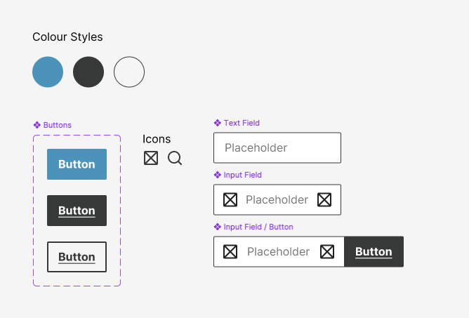
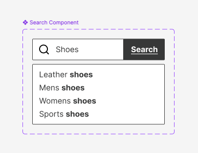
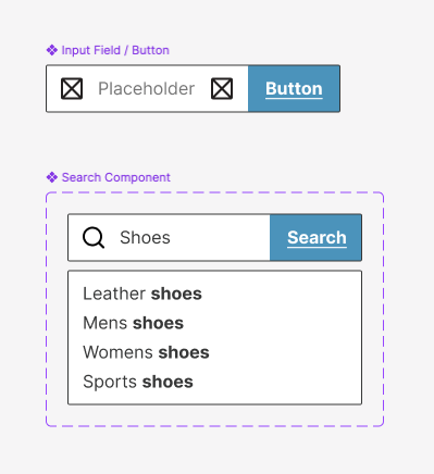
What I began to notice, is that if everything is set up correctly, each of the elements if edited alone can quickly be used to update more complex design elements. In the example here I’ve built a button, with a colour style assigned. Then created an input field and combined the two. The third step is to create a dropdown panel for search suggestions, once that’s done I can create a component that can later be used to build either more complex components or organisms (containing multiple components).
By choosing to change the type of CTA button used in input fields, we can automatically update all the other components that utilise the input field.
Being someone that loves to build systems, then utilise them and see them in action, I love these features of Figma. The efficiency that this creates is awesome. It really allows small design teams to build big things quickly whilst being nimble enough to make changes when required.
 Jake Bolton
Leave a comment