
This was a relatively new type of project for me, I’ve worked extensively on marketing email design in the past, however I had never previously been asked to create the UI for an inbox within an app.
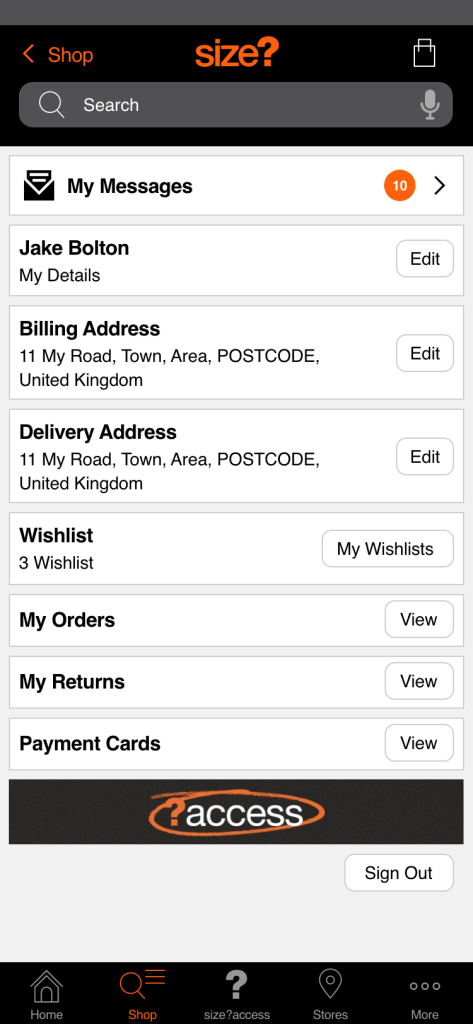
The CRM team wanted to have more direct contact with customers directly through the size? native app. At the time, size? was communicating directly with customers mostly through email and it wasn’t clear how many conversions through the app were attributable to marketing emails, or how to split that traffic between the app and the mobile site.
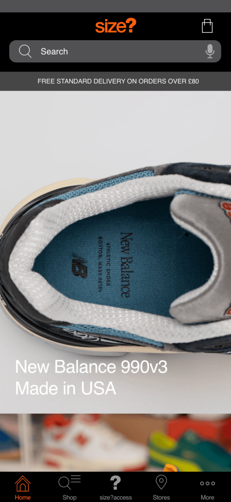
Note: Internally we refer to the size? app as native, this is because the business also has an app specifically for launches, where customers can enter raffles for exclusive sneaker launches.
The app platform used by the business was already developed, we just needed to restyle the UI to be as accessible as possible, whilst fitting with the UI of the rest of the app.
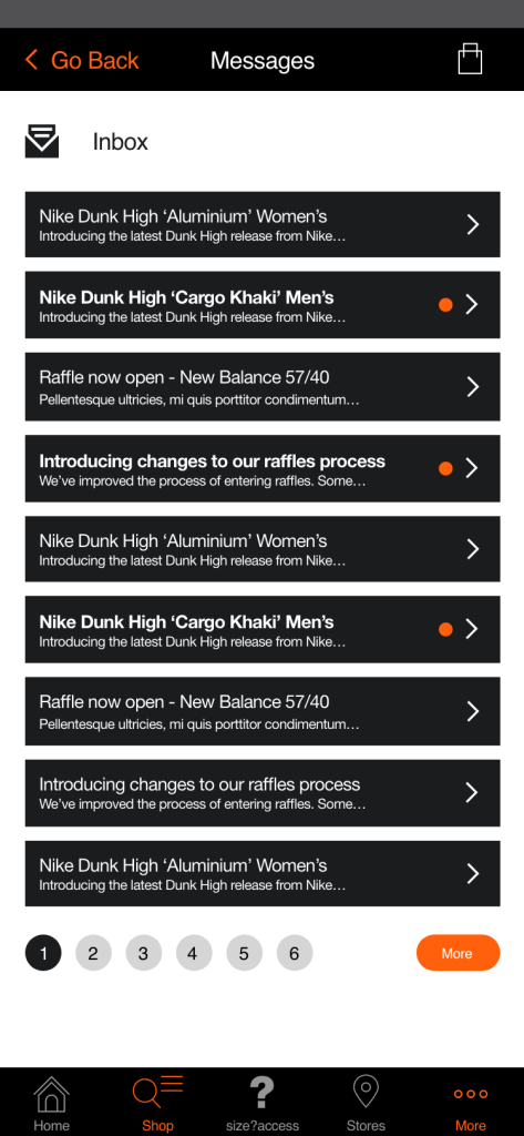
The downside of having an already built message centre within the app, was the lack of control over the user experience. In this case we needed to clearly represent message preview buttons as well as properly highlighting unread messages. That last point was really important, as we wanted customers to notice and read announcements that were put out by the CRM team.
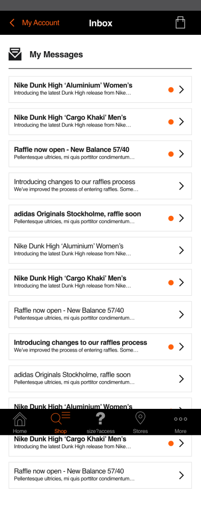
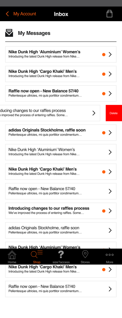
In the next version, I wanted to try to improve the accessibility of the message previews in the inbox. To do this I increased the touch area of the message previews, which would also help users to interact with the preview if they wanted to delete messages, preferably quickly.
After discussing internally with stakeholders on the CRM team, the main issue that came up with this version of the design was the page length and the amount of scrolling that would be required. This would be a particular issue when the app inbox was full. The challenge at that point was to properly highlight message previews whilst keeping them compact enough. We wanted to be able to display more messages above the fold on any given mobile device.
The final developed version of the experience for users was a compromise between the commercial needs of the business and the accessibility and experience needs of users. Message previews were now contained within preview buttons which could be easily deleted with a sideways swipe from right to left.
Roundels used to highlight unread messages were now placed on the right of the message preview, this was so that it wouldn’t distract the user from the message title. This was an issue highlighted by internal stakeholders on the CRM team.
If you would like to know more about the size? native app, this is available through for both android and iOS devices, learn more here: https://www.size.co.uk/
