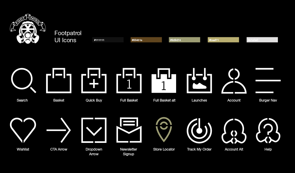
It was 2019, Footpatrol were looking for a set of icons based on a UI kit that we had done for size? not long before. I wanted to create icons for Footpatrol that would align with the urban/military theme of the brand.
After searching for inspiration, I realised that stencils are often associated with the military. With that in mind I started to imagine what the icons would look like if I designed them as stencils. This was an interesting exercise as it lead to icons that had a really interesting visual style. The simplicity of the theme used for the icons also meant that we could extend the icon library extensively. My hope with here was that we could use these assets for more than just UI elements, maybe in some cases we could use these as marketing assets for campaigns.
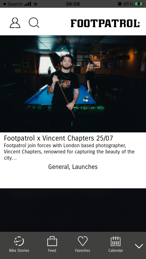
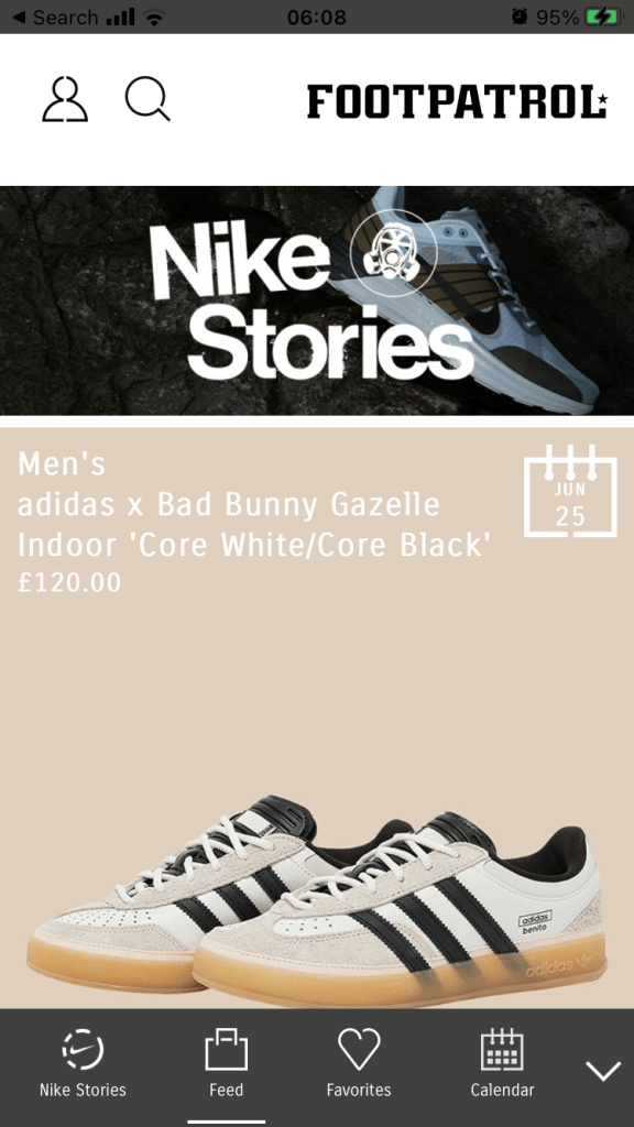
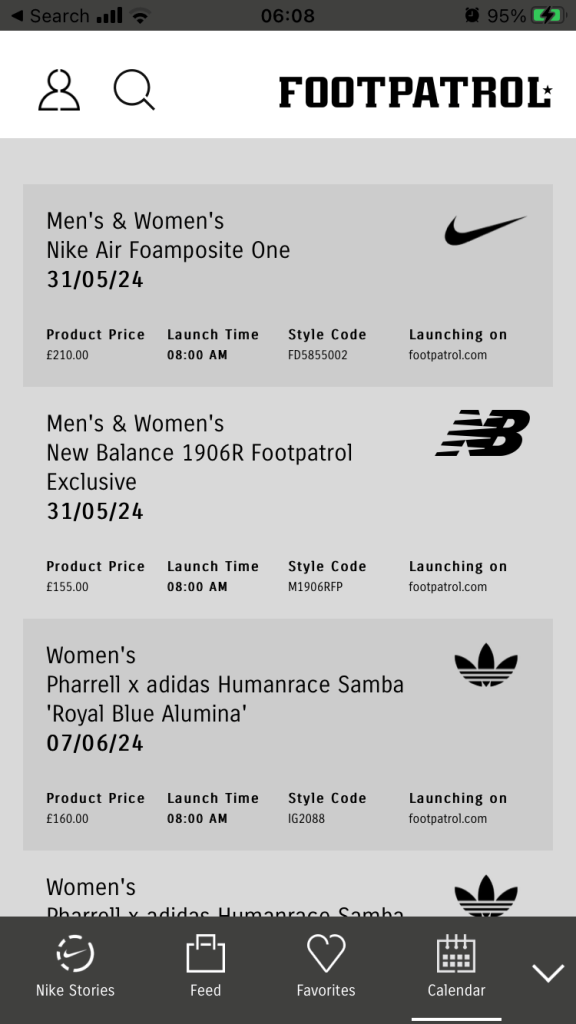
App Usage:
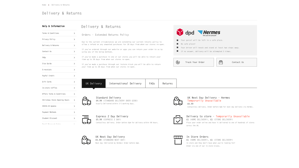
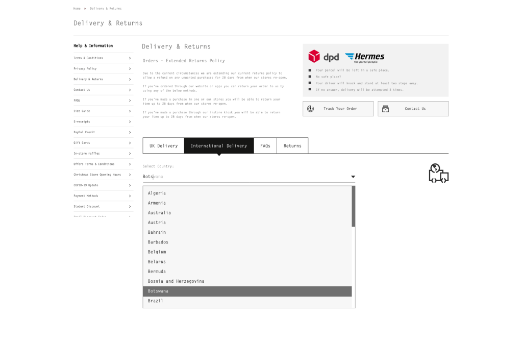
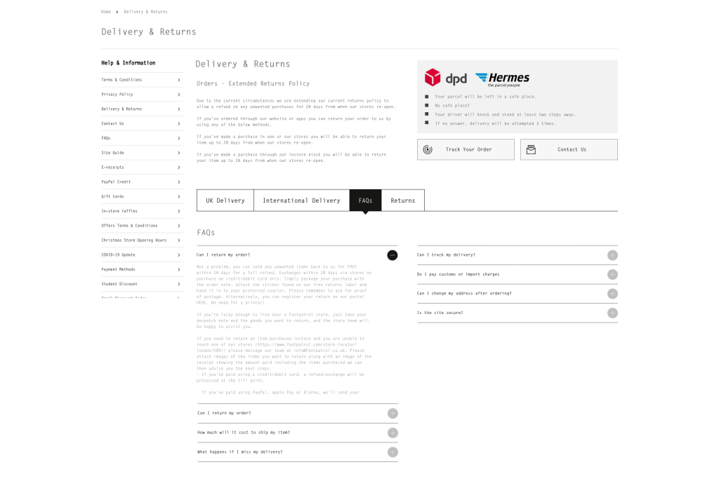
The icons also featured in some UI work that I created for the customer services section of the Footpatrol site. We needed to create a hub for customers that would assist them in finding the best option for them when something had gone wrong with their order.
The process for these was quite simple really, I built artboards in Adobe Illustrator with a 10x10px grid, then a applied live paths to these. The next step was to expand paths to convert paths into shapes…
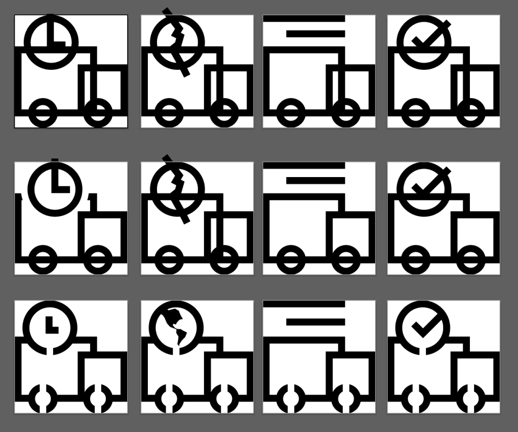
Once these had been built, the next step was to use the shape builder tool in Adobe Illustrator, to knock out parts of the shapes. This created the negative space that enabled the stencil affect that formed the theme that features throughout.
